When was the last time you thought about colour? The chances are it was more recently than you think. From picking out what to wear in the morning to selecting items on the supermarket shelf, to painting the walls of a new home, colour plays a huge part in our decisions — whether we’re conscious of it or not.
It’s well documented that colour elicits unique emotional responses in people. Certain shades are so heavily associated with emotions or character traits that their names have become interchangeable — green for envy, or blue for sadness, for instance. And an entire discipline of psychology is dedicated to studying the effects of colour on how we feel and behave.
But how does colour translate to the working environment? There’s
a great deal of research around the impact of colour on the way we perform in professional contexts. However, it’s a factor that’s often overlooked by department heads and HR managers, which could mean the wrong environment is being created and employees aren’t reaching their full potential in the workplace.
We decided to delve a little deeper into the theory to find out which characteristics are stimulated by which colours, and therefore which shades are most likely to boost productivity in different types of business.

“Colour in the work environment is one of the most important factors that influence the thoughts, moods and behaviour of the people who work there,” explains colour therapy consultant Suzy Chiazzari, principal of the
Holistic Design Institute. “Our sight is our primary sense, so the atmosphere on entering the office space will set the tone of one’s experience for the whole day.
“Walking into a bright, visually colour-diverse space stimulates the brain and the production of endorphins that reinforce a feeling of wellbeing and enthusiasm for the job at hand. But entering a monotonous, dreary or dark office can cause workers to psychologically link their workplace to feelings of drudgery and constriction.”
For this reason, Suzy advises against using “an entirely neutral colour palette” in workspaces — a tip
that’s been recommended previously.
But use of colour must be considered carefully and take into account a number of factors, according to colour teacher trainer
Priscilla Elliott. “Colour can either increase productivity directly or it can be used to alleviate problems in the office, which then indirectly increases productivity,” she says. “It very much depends on a) the type of business you’re in, and b) the ‘personality’ and issues within your current workforce.”
With that in mind, what’s the theory behind the shade chart? We asked colour experts to break it down.
Blue & green
Despite its sorrowful connotations, blue is thought to be perceived somewhat differently in professional environments. Sandra Sparrowhawk, colour and style coach at
Colourworx, says blue is associated with ‘logic’, while Priscilla adds it’s a colour that facilitates conversation: “[It] would be great to use in an office where communication is key — such as the media,” she says.
However, blue should be used in moderation and in contrast with other shades to offset the ‘sad’ associations, warns
Alison Standish, author of
Know Your Colour Personality. “Blue on its own can be very cool and maybe make employees feel a little ‘blue’. Pop this colour with yellow or orange to bring in a bit of warmth to the environment,” she advises.
Green can create a calming atmosphere, while adding vibrancy to office spaces located in built-up, urban areas according to our experts. “If there is not much natural light or a view of nature then green is a fabulous colour to add,” says Alison. “The more yellow in the green will create growth and a feeling of newness. Emerald greens bring balance and harmony to any environment.”
Olive green is also a smart choice, adds Priscilla, since it “can trigger competition”. “Olive is also about hope, new beginnings and being open to possibilities,” she says.

Thinking about a new design for your office but don’t know where to start? Download your free guide here.

Red & orange
Although it has the potential to become overpowering when used to excess, red can be a motivating shade in the workplace. Priscilla explains: “If you wanted to inject more energy into the environment to create a more dynamic atmosphere, then splashes of red would be great. It could be especially good if your employees are working to deadlines as red is a ‘driving’ and dynamic energy.”
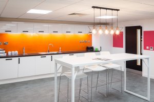
And orange has an equally positive influence when used correctly. “It’s the colour of joy and happiness — think of the sunrise and sunset,” says Alison. “We use this colour to deal with feelings of negativity and depression. We know it can help activate the serotonin in our systems and makes us feel happy.
“This colour is great in areas where people are taking time out and need to ‘let go’.”

Yellow
Yellow can be a powerful colour in the workspace, both intellectually and emotionally. “It’s the colour that helps us to organise and bring clarity to the decision-making process,” observes Alison.
It also has a positive influence on people who work with numbers, adds Priscilla. “Yellow helps to engage the intellect and cognitive processes and helps with concentration too, so [it] would be great for an accountant’s office or any environment where concentration and focus is of paramount importance for productivity.
“As well as connecting with the intellect, yellow is a very uplifting colour and can brighten people’s moods,” says Priscilla.
Violet
When the Pantone Color Institute announced
‘Ultra Violet’ as the shade of 2018, executive director Leatrice Eiseman said the “blue-based purple” inspired “artistic expression and spiritual reflection”, adding that it “takes our awareness and potential to a higher level”. The colour is often associated with mindfulness practices, Pantone explains, offering “a higher ground to those seeking refuge from today’s over-stimulated world”.
Our experts agree: Alison says violet represents “inspiration and diplomacy” and is “great for meeting rooms used for strategy and HR environments”.

Pink & coral
In 1979,
a study of American prisons found that by painting the walls pink, aggressive behaviours reduced. And the concept applies in working environments too, Priscilla claims: “This colour may not be an obvious choice for an office but if you wanted to create a more ‘loving’ or ‘nurturing’ environment, such as healthcare or wellbeing, then either of these colours — especially coral — would connect people to a nurturing, healing and sensitive environment.”
Magenta, meanwhile, is an effective colour to splash in reception areas and rooms where you might present to clients, according to Alison.

Brown & copper
The earthy tones of brown and copper can have a positive influence when used in small amounts, helping people to feel more “down-to-earth and grounded”, Priscilla says. But she warns, using too many brown or beige tones in the workspace could make clients and prospective employees feel unsure of “where the company stands” and leave them feeling “a little unsettled”.
Be smart with colour
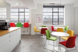
When bringing colour into workspaces, a good rule of thumb is moderation, say our experts. “Too much of any one colour range will exaggerate the qualities of that colour, so it’s best to incorporate good contrasts, as well as warm and cool shades, within the entire office environment,” explains Suzy.
Teacher and colour therapist
Katherine Louise Jones agrees that choosing colours for office design is “an interesting challenge”. “My suggestion would be to create zones of colour to encourage areas of rest, creativity, productivity and performance,” she says.
Based on the analysis provided by our experts, colour-coding these areas using the following guidelines could help provoke the emotions or state of mind that allow staff to get the most out of the time they spend there.
- rest zone — green, pink/coral
- creativity zone — blue, violet, splashes of red
- productivity/performance zone — yellow, olive green
- break-out/lunch area — orange
- reception area — splashes of magenta
However, Katherine warns, there is no ‘one-size-fits-all’ approach when it comes to office colour schemes: “Thought and attention would need to go into planning colour in any environment, taking into consideration other factors such as natural light and the amount of space,” she explains. For this reason,
collaboration with a design specialist is vital to striking the right balance for your business.
And although incorporating the company’s dominant brand colours into the space can be important for recognition and impact, it’s a good idea to heed the advice of the experts and resist the temptation to let any particular colour dominate.
At Dale, we believe using colour effectively is an integral part of creating a workspace that reflects your organisation’s culture. The result will be happier, more inspired employees whose state of mind will be reflected in their performance.
We care about the details — our designers will work closely with you to create a workspace that promotes wellbeing and optimises the performance of your staff.
Get in touch to find out what we could do for you.


 “Colour in the work environment is one of the most important factors that influence the thoughts, moods and behaviour of the people who work there,” explains colour therapy consultant Suzy Chiazzari, principal of the Holistic Design Institute. “Our sight is our primary sense, so the atmosphere on entering the office space will set the tone of one’s experience for the whole day.
“Walking into a bright, visually colour-diverse space stimulates the brain and the production of endorphins that reinforce a feeling of wellbeing and enthusiasm for the job at hand. But entering a monotonous, dreary or dark office can cause workers to psychologically link their workplace to feelings of drudgery and constriction.”
For this reason, Suzy advises against using “an entirely neutral colour palette” in workspaces — a tip that’s been recommended previously.
But use of colour must be considered carefully and take into account a number of factors, according to colour teacher trainer Priscilla Elliott. “Colour can either increase productivity directly or it can be used to alleviate problems in the office, which then indirectly increases productivity,” she says. “It very much depends on a) the type of business you’re in, and b) the ‘personality’ and issues within your current workforce.”
With that in mind, what’s the theory behind the shade chart? We asked colour experts to break it down.


